

UX/UI · Layout Design
UX/UI · Layout Design
UX/UI · Layout Design
SHATILA BAKERY
SHATILA BAKERY
SHATILA BAKERY

OVERVIEW
OVERVIEW
OVERVIEW
Shatila Bakery is a specialty dessert brand known for its traditional Middle Eastern sweets and baked goods. For this project, I designed and prototyped a website to modernize its digital presence, improve usability, and create a seamless experience from browsing products to completing a purchase.
Shatila Bakery is a specialty dessert brand known for its traditional Middle Eastern sweets and baked goods. For this project, I designed and prototyped a website to modernize its digital presence, improve usability, and create a seamless experience from browsing products to completing a purchase.
Shatila Bakery is a specialty dessert brand known for its traditional Middle Eastern sweets and baked goods. For this project, I designed and prototyped a website to modernize its digital presence, improve usability, and create a seamless experience from browsing products to completing a purchase.

Role
UX/UI Designer & Brand Designer
Tools
Figma · Adobe CC
Deliverables
Prototyped Website & Collateral
Year
2025
Role
UX/UI Designer
& Layout Designer
UX/UI Designer & Brand Designer
Deliverables
Website Prototype
& Collateral
Website Prototype & Collateral
Tools
Figma · Adobe CC
Figma · Adobe CC
Year
2026
2026
THE SHIFT
THE SHIFT
THE SHIFT
What began as a layout exploration revealed deeper usability issues.
What began as a layout exploration revealed deeper usability issues.
What began as a layout exploration revealed deeper usability issues.
Originally this project focused on creating print materials, campaign ads, a brochure, and a catalog book. However, while working through these layouts, I began to notice larger issues within Shatila Bakery's existing digital experience.
Originally this project focused on creating print materials, campaign ads, a brochure, and a catalog book. However, while working through these layouts, I began to notice larger issues within Shatila Bakery's existing digital experience.
Originally this project focused on creating print materials, campaign ads, a brochure, and a catalog book. However, while working through these layouts, I began to notice larger issues within Shatila Bakery's existing digital experience.
Original Scope
Original Scope
Original Scope

Billboard, Magazine Page, & Social Media Ads
Billboard, Magazine Page, & Social Media Ads
Billboard, Magazine Page, & Social Media Ads
Brochure
Brochure
Brochure
Catalog Book
Catalog Book
Catalog Book
The Shift
The Shift
The Shift
While designing these print materials, I noticed several usability and visual issues within the existing website. This realization shifted the project from a purely visual exercise into a more user-focused redesign aimed at improving navigation, hierarchy, and overall experience.
While designing these print materials, I noticed several usability and visual issues within the existing website. This realization shifted the project from a purely visual exercise into a more user-focused redesign aimed at improving navigation, hierarchy, and overall experience.
While designing these print materials, I noticed several usability and visual issues within the existing website. This realization shifted the project from a purely visual exercise into a more user-focused redesign aimed at improving navigation, hierarchy, and overall experience.
Pain Points
Pain Points
The Challenge

Evaluating the existing experience uncovered key usability gaps
Evaluating the existing experience uncovered key usability gaps
Evaluating the existing experience uncovered key usability gaps
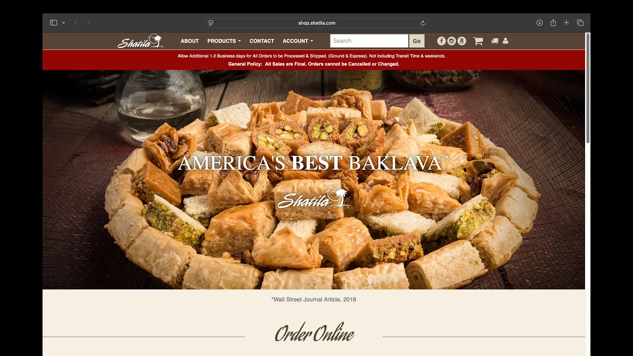
A closer look at the current website revealed several challenges that impacted both usability and overall brand perception. These issues highlighted the need for a more structured, intuitive, and visually engaging experience.
A closer look at the current website revealed several challenges that impacted both usability and overall brand perception. These issues highlighted the need for a more structured, intuitive, and visually engaging experience.
A closer look at the current website revealed several challenges that impacted both usability and overall brand perception. These issues highlighted the need for a more structured, intuitive, and visually engaging experience.
Key Issues Identified
Key Issues Identified
Key Issues Identified
Cluttered product listings with little structure
Cluttered product listings with little structure
Cluttered product listings with little structure
Confusing navigation
Confusing navigation
Confusing navigation
Weak visual hierarchy making content hard to scan
Weak visual hierarchy making content hard to scan
Weak visual hierarchy making content hard to scan
Outdated design that doesn’t reflect product quality
Outdated design that doesn't reflect product quality
Outdated design that doesn't reflect product quality
No clear path from browsing to checkout
No clear path from browsing to checkout
No clear path from browsing to checkout
Limited storytelling of the brand’s heritage
Limited storytelling of the brand’s heritage
Limited storytelling of the brand’s heritage
GOALS
GOALS
GOALS
Redefining the experience through a clear design direction
Redefining the experience through a clear design direction
Redefining the experience through a clear design direction
A set of design goals were established, focusing on improving usability, strengthening visual hierarchy, and creating a more cohesive brand experience across both print and digital platforms
A set of design goals were established, focusing on improving usability, strengthening visual hierarchy, and creating a more cohesive brand experience across both print and digital platforms
A set of design goals were established, focusing on improving usability, strengthening visual hierarchy, and creating a more cohesive brand experience across both print and digital platforms
Project Goals
Project Goals
Project Goals
Modernize the overall brand experience
Modernize the overall brand experience
Modernize the overall brand experience
Improve product discovery and navigation
Improve product discovery and navigation
Improve product discovery and navigation
Create a seamless browsing-to-purchase flow
Create a seamless browsing-to-purchase flow
Create a seamless browsing-to-purchase flow
Maintain cultural authenticity while elevating design
Maintain cultural authenticity while elevating design
Maintain cultural authenticity while elevating design
Experience Goals
Experience Goals
Experience Goals
Create a visually rich and inviting browsing experience
Create a visually rich and inviting browsing experience
Create a visually rich and inviting browsing experience
Highlight product detail and craftsmanship
Highlight product detail and craftsmanship
Highlight product detail and craftsmanship
Reduce friction in the purchasing process
Reduce friction in the purchasing process
Reduce friction in the purchasing process
Guide users through clear and intuitive interactions
Guide users through clear and intuitive interactions
Guide users through clear and intuitive interactions
TARGET MARKET
TARGET MARKET
TARGET MARKET
Defining who the experience is designed to support
Defining who the experience is designed to support
Defining who the experience is designed to support
I considered primary users interacting with the site to ensure the experience aligns with their behaviors, expectations, and goals when browsing and purchasing bakery products online.
I considered primary users interacting with the site to ensure the experience aligns with their behaviors, expectations, and goals when browsing and purchasing bakery products online.
I considered primary users interacting with the site to ensure the experience aligns with their behaviors, expectations, and goals when browsing and purchasing bakery products online.
User Profile
User Profile
User Profile
Adults aged 25–55, including working professionals, families, and individuals purchasing for gatherings or events
Adults aged 25–55, including working professionals, families, and individuals purchasing for gatherings or events
Adults aged 25–55, including working professionals, families, and individuals purchasing for gatherings or events
Balanced gender distribution with a mix of household types and cultural backgrounds
Balanced gender distribution with a mix of household types and cultural backgrounds
Balanced gender distribution with a mix of household types and cultural backgrounds
Moderate tech familiarity, comfortable browsing and ordering online but prefers simplicity
Moderate tech familiarity, comfortable browsing and ordering online but prefers simplicity
Moderate tech familiarity, comfortable browsing and ordering online but prefers simplicity
Middle to upper-middle income, with spending focused on quality food and specialty items
Middle to upper-middle income, with spending focused on quality food and specialty items
Middle to upper-middle income, with spending focused on quality food and specialty items
Behaviors & Mindset
Behaviors & Mindset
Behaviors & Mindset
Visually driven when browsing food, often influenced by presentation and imagery
Visually driven when browsing food, often influenced by presentation and imagery
Visually driven when browsing food, often influenced by presentation and imagery
Value quality, authenticity, and cultural richness in products
Value quality, authenticity, and cultural richness in products
Value quality, authenticity, and cultural richness in products
Tend to browse categories before narrowing down specific items
Tend to browse categories before narrowing down specific items
Tend to browse categories before narrowing down specific items
Prefer experiences that feel easy, intuitive, and not overwhelming
Prefer experiences that feel easy, intuitive, and not overwhelming
Prefer experiences that feel easy, intuitive, and not overwhelming
Needs & Expectations
Needs & Expectations
Needs & Expectations
Clear product organization with easy navigation between categories
Clear product organization with easy navigation between categories
Clear product organization with easy navigation between categories
High quality visuals and detailed product information
High quality visuals and detailed product information
High quality visuals and detailed product information
A smooth and straightforward path from browsing to checkout
A smooth and straightforward path from browsing to checkout
A smooth and straightforward path from browsing to checkout
Consistent branding that reflects product quality and trust
Consistent branding that reflects product quality and trust
Consistent branding that reflects product quality and trust
Motivation & Goals
Motivation & Goals
Motivation & Goals
Purchase desserts for personal enjoyment, gifting, or special occasions
Purchase desserts for personal enjoyment, gifting, or special occasions
Purchase desserts for personal enjoyment, gifting, or special occasions
Find high quality, authentic products without spending too much time searching
Find high quality, authentic products without spending too much time searching
Find high quality, authentic products without spending too much time searching
Feel confident in product selection through clear information and visuals
Feel confident in product selection through clear information and visuals
Feel confident in product selection through clear information and visuals
Complete purchases quickly and efficiently without friction
Complete purchases quickly and efficiently without friction
Complete purchases quickly and efficiently without friction
Sitemap
Sitemap
Sitemap
Restructuring the site to create a clearer path to products
Restructuring the site to create a clearer path to products
Restructuring the site to create a clearer path to products
I reworked the site architecture to simplify navigation and make product discovery more intuitive. The updated structure prioritizes key categories and creates a more direct path from exploration to purchase.
I reworked the site architecture to simplify navigation and make product discovery more intuitive. The updated structure prioritizes key categories and creates a more direct path from exploration to purchase.
I reworked the site architecture to simplify navigation and make product discovery more intuitive. The updated structure prioritizes key categories and creates a more direct path from exploration to purchase.

User Flow
User Flow
User Flow
Mapping the journey from discovery to checkout
Mapping the journey from discovery to checkout
Mapping the journey from discovery to checkout
To ensure a seamless purchasing experience, I mapped the key user flow from landing on the site to completing a purchase. This flow highlights how users navigate through product discovery, selection, and checkout, while identifying key interaction points and decision moments along the way.
To ensure a seamless purchasing experience, I mapped the key user flow from landing on the site to completing a purchase. This flow highlights how users navigate through product discovery, selection, and checkout, while identifying key interaction points and decision moments along the way.
To ensure a seamless purchasing experience, I mapped the key user flow from landing on the site to completing a purchase. This flow highlights how users navigate through product discovery, selection, and checkout, while identifying key interaction points and decision moments along the way.

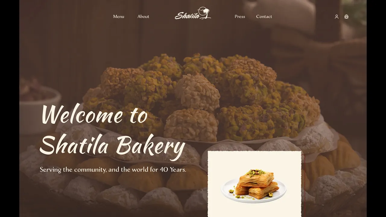
Visual Identity
Visual Identity
Visual Identity
Bringing the experience to life through interface and interaction
Bringing the experience to life through interface and interaction
Bringing the experience to life through interface and interaction
The visual direction was refined to better reflect the quality and cultural richness of the brand. Through typography, color, and imagery, the goal was to create a more premium and immersive experience.
The visual direction was refined to better reflect the quality and cultural richness of the brand. Through typography, color, and imagery, the goal was to create a more premium and immersive experience.
The visual direction was refined to better reflect the quality and cultural richness of the brand. Through typography, color, and imagery, the goal was to create a more premium and immersive experience.

WIREFRAMES
WIREFRAMES
WIREFRAMES
Establishing structure before refining the visual experience
Establishing structure before refining the visual experience
Establishing structure before refining the visual experience
Wireframes were used to map out layout, hierarchy, and content placement. This step ensured that usability and structure were prioritized before moving into high fidelity design.
Wireframes were used to map out layout, hierarchy, and content placement. This step ensured that usability and structure were prioritized before moving into high fidelity design.
Wireframes were used to map out layout, hierarchy, and content placement. This step ensured that usability and structure were prioritized before moving into high fidelity design.


FINAL DESIGN DECISIONS
FINAL DESIGN DECISIONS
FINAL DESIGN DECISIONS
Adding Depth Through Interactive Motion
Adding Depth Through Interactive Motion
Adding Depth Through Interactive Motion
Parallax scrolling was introduced to create a more immersive and dynamic experience. Inspired by the layered textures of the desserts, this interaction adds visual depth and movement, making the interface feel more engaging while still maintaining usability.
Parallax scrolling was introduced to create a more immersive and dynamic experience. Inspired by the layered textures of the desserts, this interaction adds visual depth and movement, making the interface feel more engaging while still maintaining usability.
Parallax scrolling was introduced to create a more immersive and dynamic experience.
Inspired by the layered textures of the desserts, this interaction adds visual depth and movement, making the interface feel more engaging while still maintaining usability.
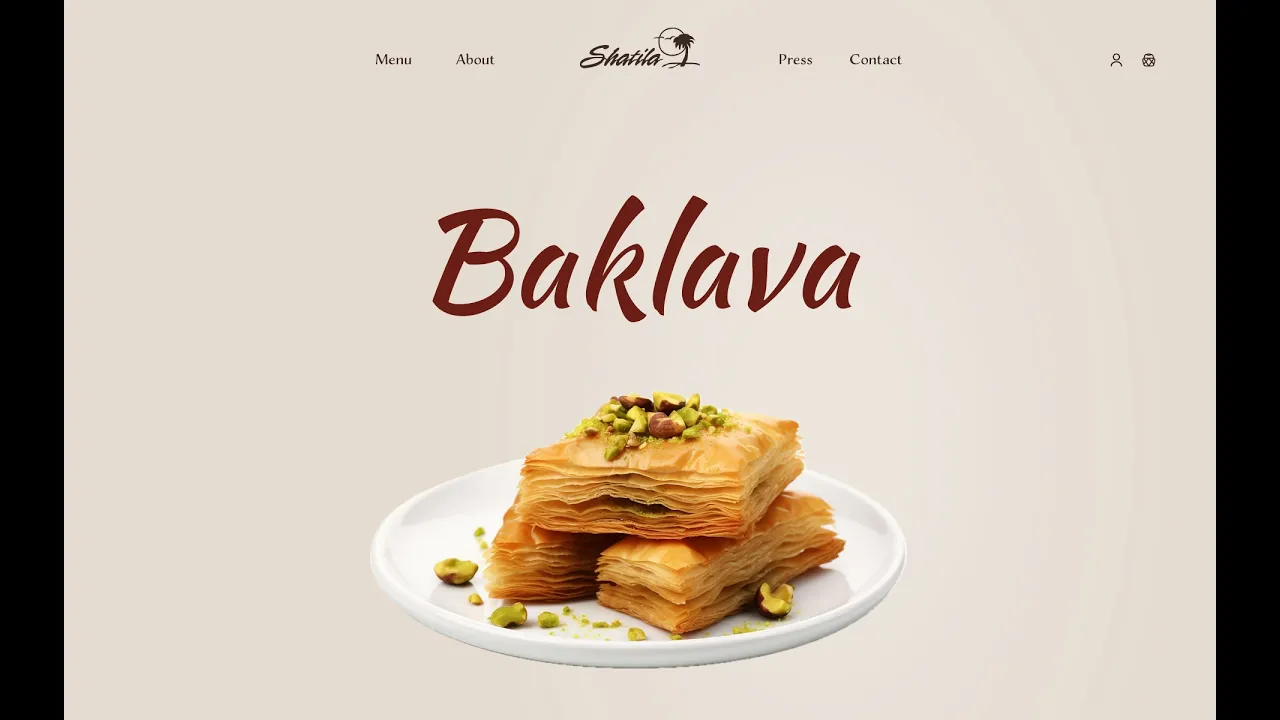
Improving Product Discovery Through Clear Structure
Improving Product Discovery Through Clear Structure
Improving Product Discovery Through Clear Structure
To reduce the overwhelming nature of the original product listings, I introduced a more structured layout with clear category separation and consistent spacing. This allows users to quickly scan products and navigate between sections without confusion, making the browsing experience more intuitive and efficient.
To reduce the overwhelming nature of the original product listings, I introduced a more structured layout with clear category separation and consistent spacing. This allows users to quickly scan products and navigate between sections without confusion, making the browsing experience more intuitive and efficient.
To reduce the overwhelming nature of the original product listings, I introduced a more structured layout with clear category separation and consistent spacing.
This allows users to quickly scan products and navigate between sections without confusion, making the browsing experience more intuitive and efficient.
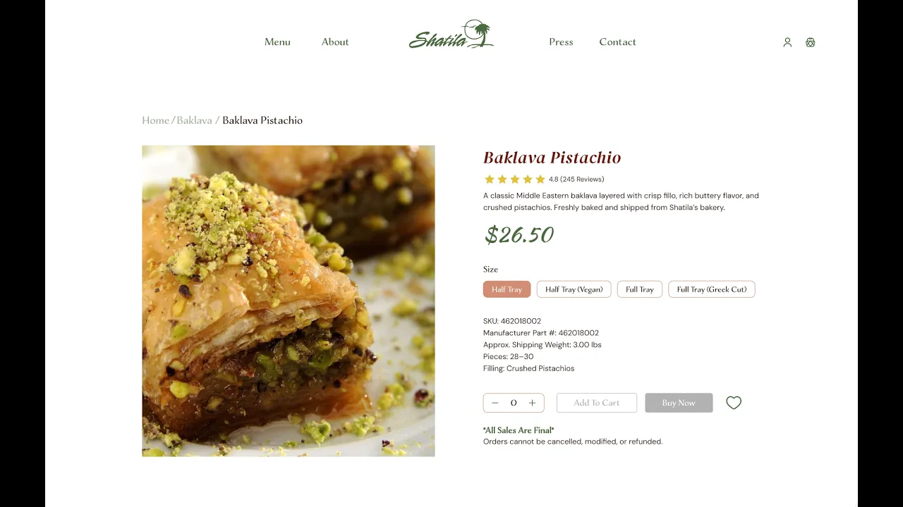
Guiding Users From Selection To Purchase
Guiding Users From Selection To Purchase
Guiding Users From Selection To Purchase
Dedicated product pages were designed to provide clear information and a focused user experience, helping users make confident decisions. A streamlined add-to-cart and cart flow reduces friction and creates a more seamless transition from browsing to purchasing.
Dedicated product pages were designed to provide clear information and a focused user experience, helping users make confident decisions. A streamlined add-to-cart and cart flow reduces friction and creates a more seamless transition from browsing to purchasing.
Dedicated product pages were designed to provide clear information and a focused user experience, helping users make confident decisions.
A streamlined add-to-cart and cart flow reduces friction and creates a more seamless transition from browsing to purchasing.
COLLATERAL
COLLATERAL
COLLATERAL
Extending the visual system across print and promotional materials
Extending the visual system across print and promotional materials
Extending the visual system across print and promotional materials
The design system was applied beyond digital into a series of print deliverables, including campaign ads, a brochure, and a catalog, creating a cohesive brand experience across all touchpoints.
The design system was applied beyond digital into a series of print deliverables, including campaign ads, a brochure, and a catalog, creating a cohesive brand experience across all touchpoints.
The design system was applied beyond digital into a series of print deliverables, including campaign ads, a brochure, and a catalog, creating a cohesive brand experience across all touchpoints.
Campaign Ads
Campaign Ads
Campaign Ads
Designed to capture attention and highlight featured products through bold visuals and clear messaging.
Designed to capture attention and highlight featured products through bold visuals and clear messaging.
Designed to capture attention and highlight featured products through bold visuals and clear messaging.


Brochure
Brochure
Brochure
Provides an overview of the brand and offerings, combining storytelling with structured information.
Provides an overview of the brand and offerings, combining storytelling with structured information.
Provides an overview of the brand and offerings, combining storytelling with structured information.

Catalog Book
Catalog Book
Catalog Book
Organizes a wide range of products into a clean, visually engaging format that supports easy browsing.
Organizes a wide range of products into a clean, visually engaging format that supports easy browsing.
Organizes a wide range of products into a clean, visually engaging format that supports easy browsing.


REFLECTION
REFLECTION
REFLECTION
Letting the Project Evolve
Letting the Project Evolve
Letting the Project Evolve
What began as a layout design project gradually expanded into something much larger. As I worked through the print materials, I started noticing opportunities to improve the website experience as well, which pushed me to think more critically about usability, structure, and how the brand could feel more cohesive across both print and digital.
What began as a layout design project gradually expanded into something much larger. As I worked through the print materials, I started noticing opportunities to improve the website experience as well, which pushed me to think more critically about usability, structure, and how the brand could feel more cohesive across both print and digital.
What began as a layout design project gradually expanded into something much larger. As I worked through the print materials, I started noticing opportunities to improve the website experience as well, which pushed me to think more critically about usability, structure, and how the brand could feel more cohesive across both print and digital.
Exploring Motion Through Parallax
Exploring Motion Through Parallax
Exploring Motion Through Parallax
This project also gave me the chance to experiment with parallax scrolling for the first time. I wanted to push the prototype beyond static screens and create a more immersive experience, and this helped me think about how motion can add depth, enhance storytelling, and make a design feel more memorable when used intentionally.
This project also gave me the chance to experiment with parallax scrolling for the first time. I wanted to push the prototype beyond static screens and create a more immersive experience, and this helped me think about how motion can add depth, enhance storytelling, and make a design feel more memorable when used intentionally.
This project also gave me the chance to experiment with parallax scrolling for the first time. I wanted to push the prototype beyond static screens and create a more immersive experience, and this helped me think about how motion can add depth, enhance storytelling, and make a design feel more memorable when used intentionally.
Future Improvements
Future Improvements
Future Improvements
If I were to continue developing this project, I would focus on strengthening the UX process through user research and testing to better validate design decisions. I would also explore refining the checkout flow and accessibility to ensure the experience is not only visually engaging, but also intuitive and inclusive for a wider range of users.
If I were to continue developing this project, I would focus on strengthening the UX process through user research and testing to better validate design decisions. I would also explore refining the checkout flow and accessibility to ensure the experience is not only visually engaging, but also intuitive and inclusive for a wider range of users.
If I were to continue developing this project, I would focus on strengthening the UX process through user research and testing to better validate design decisions. I would also explore refining the checkout flow and accessibility to ensure the experience is not only visually engaging, but also intuitive and inclusive for a wider range of users.